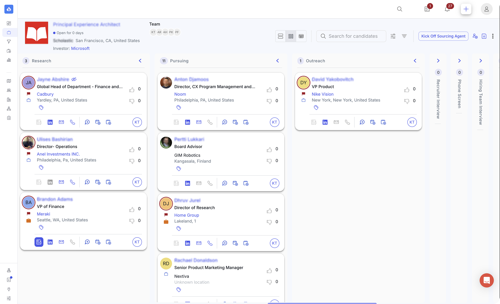
The problemA tracking tool, not a workspace
The original app was built ad hoc. It was disjointed and clunky to navigate, and recruiters did most of their real work somewhere else: email, LinkedIn Recruiter, phone calls, and spreadsheets. The app was mostly a tracking tool for sharing status with teammates or clients.
Hiring managers had no access at all. Recruiters assembled reports and presentations by hand for every client conversation, and that could take hours.
The ideaOne page for the entire search
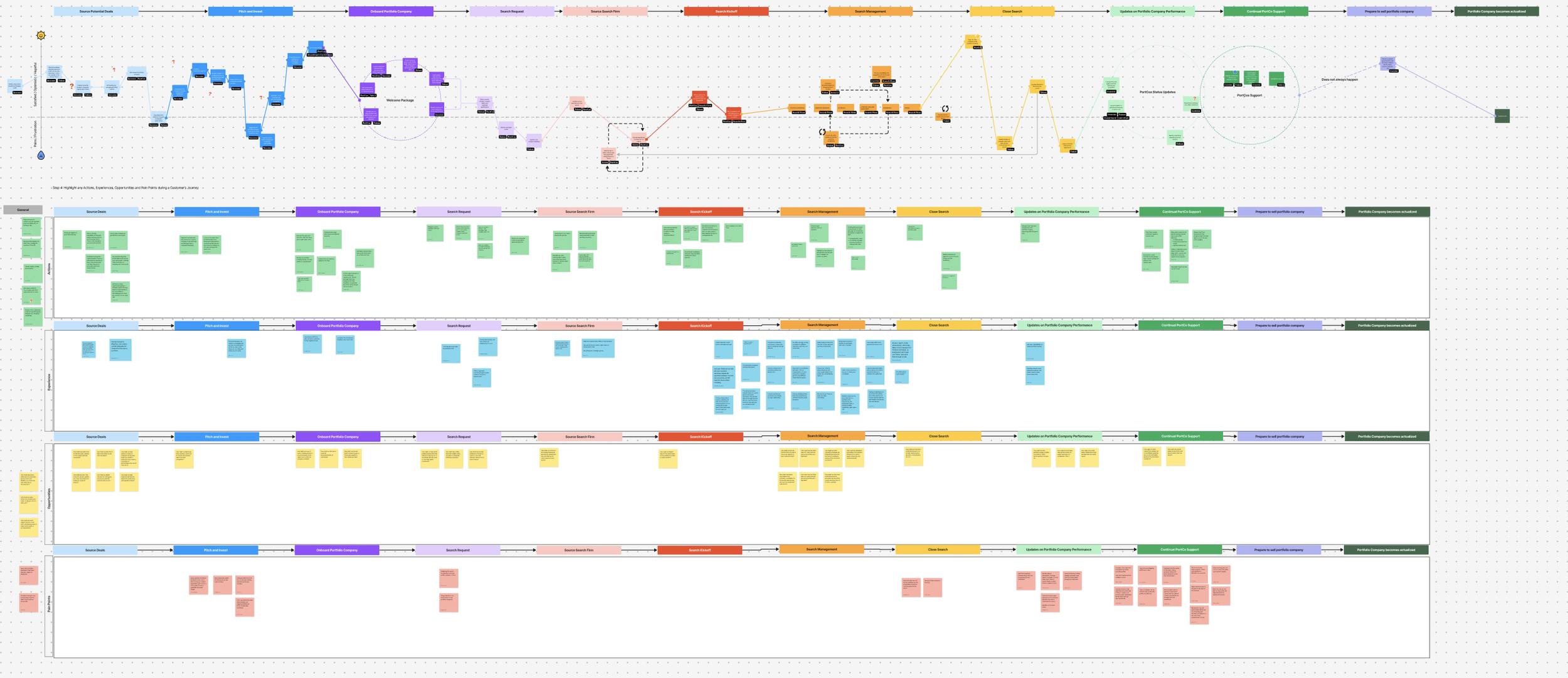
The kickoff call, strategy and research, sourcing candidates, presenting candidates, summary reports and pre-call agendas, interviews, assessments, offer letters, and placement. After a search ends, the Project keeps working: it becomes a benchmark for similar roles, a source of future candidates, and a compensation comparison.
But a recruiter and a hiring manager need very different things from the same search. The principle I designed around:
“Everyone looks at the same search, but each within their own context.”
ResearchWho needs what within a search
| Stage | Search team | Hiring team | Shared |
|---|---|---|---|
| Kickoff | Runs the call, prepares with market research | Syncs on strategy and job brief | Brief, strategy |
| Sourcing | Finds candidates who fit, are open to interviewing, and are not off-limits | May provide carve-out candidates up front | Carve-out candidates, benchmark candidates |
| Presenting candidates | Curates who and what the client sees, generates reports and pre-call agendas | Reviews candidates, signals to prioritize or deprioritize candidates | Candidate CSV, selective notes, references |
| Interviews and assessments | Moves candidates between stages, collects assessments | Joins later interviews, tracks the schedule, adds their candidate assessments | Assessments, interview schedules, documents |
| Offer and placement | Prepares the compensation letter, negotiates, places the candidate | Does not see the offer in the app, but syncs with the search team in person | Relevant contract or compensation documents |
| Post-search | Reuses it as a benchmark, candidate source, and compensation comparison | None, since the job is done! | Internal only |
The recruiter's side is rich at every stage. The hiring manager's side is narrow and concentrated in the middle. That asymmetry was the design problem. Other users within a search team include the Partner, Researcher, Engagement Coordinator, and Analyst, each with their own role and goals.
DesignOne Project, three lenses
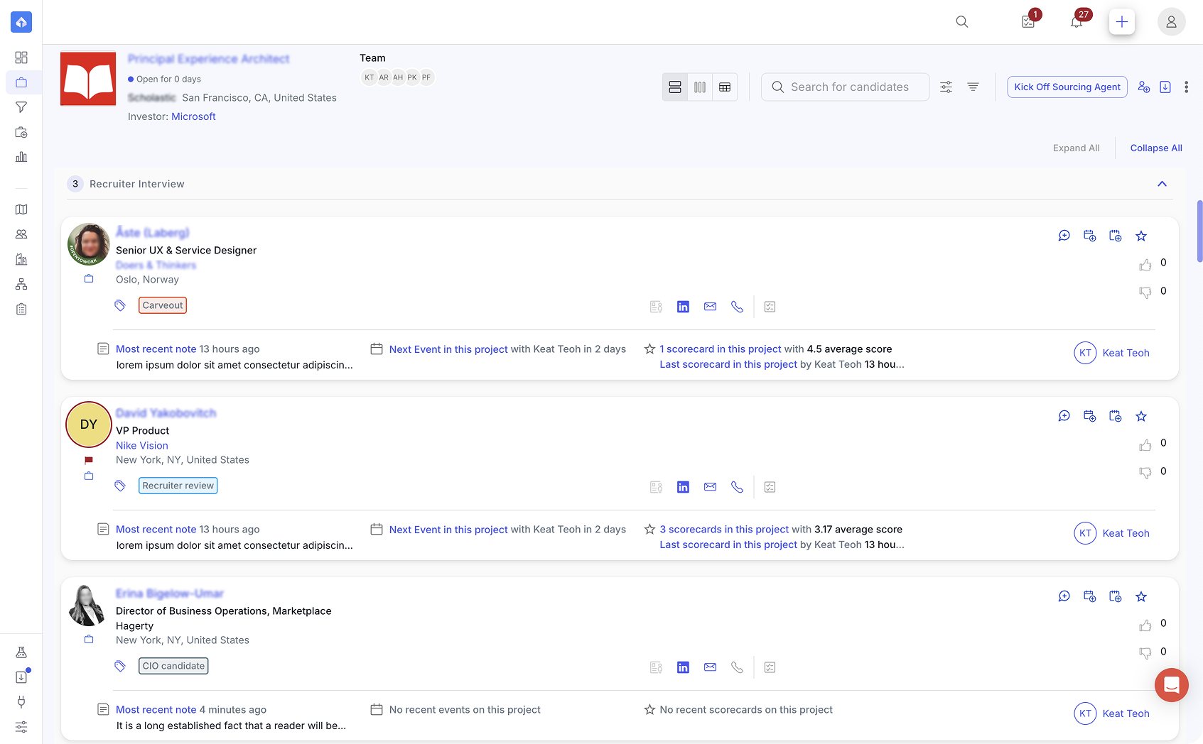
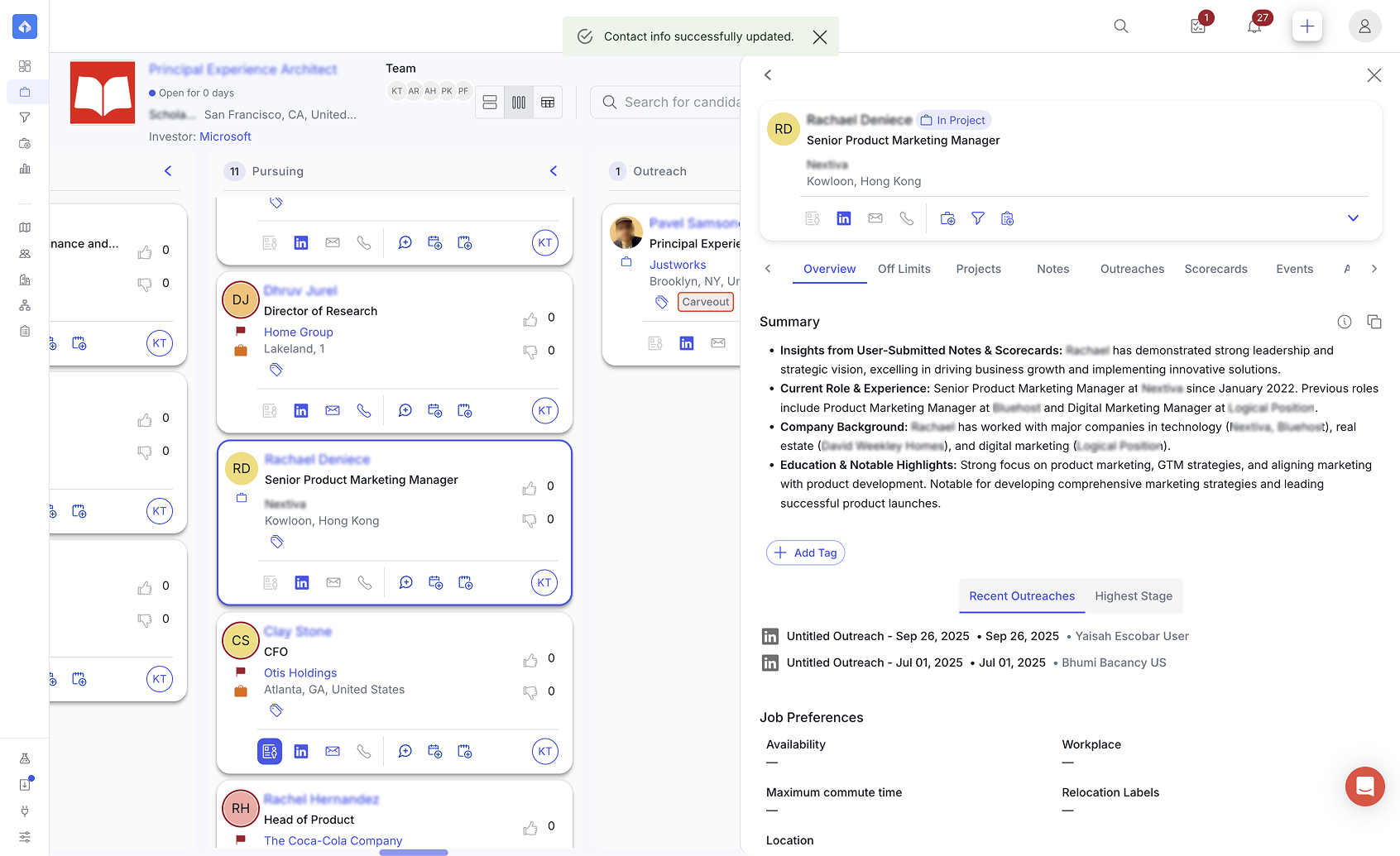
The same candidates appear in three views, each answering a different question.
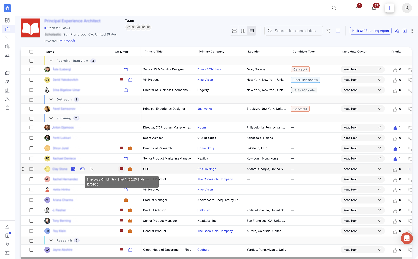
| View | The question it answers | What it adds |
|---|---|---|
| Kanban | Where is everyone in this search? | Stage flow, quick actions, team feedback |
| List | What is happening with this person? | Notes, tags, last outreach, and how many outreaches in this project versus overall |
| Table | How do I compare and act on many at once? | Off-limits as its own column, owner, priority, and sortable and filterable columns |
Information also deepens in three levels: the card shows the basics, the list adds search-progress detail, and the side panel holds everything about the person. A recruiter can step through candidates in a stage with the panel open, so they never lose their place.
I decided what belongs on a kanban card versus the side panel. The panel itself holds many tabs (experience, notes, outreaches, assessments, interviews, activity, compensation, documents, network), and I think of them in four groups: who they are, can we approach them, how is the search going, and what is sensitive.
DecisionsStandard rails, flexible content
Two decisions went in opposite directions on purpose.
- Stages are standardized.An admin sets them once for the whole customer, with logic that triggers workflows at specific stages, so every search shares one mental model of the candidate search.
- Exceptions are labeled, not special cases.A candidate the client brought in up front (a carve-out) sits in the same stage as everyone else, marked with a tag. The workflow stays simple while the data stays rich.
- Assessment criteria stay flexible.They are set per search. My co-designer moved this from an admin-managed setup to a self-service workflow, so recruiters can reuse criteria from earlier searches instead of starting from scratch or being stuck with criteria that go stale.
The rule behind both: standardize what people need to share, and let what varies stay flexible.
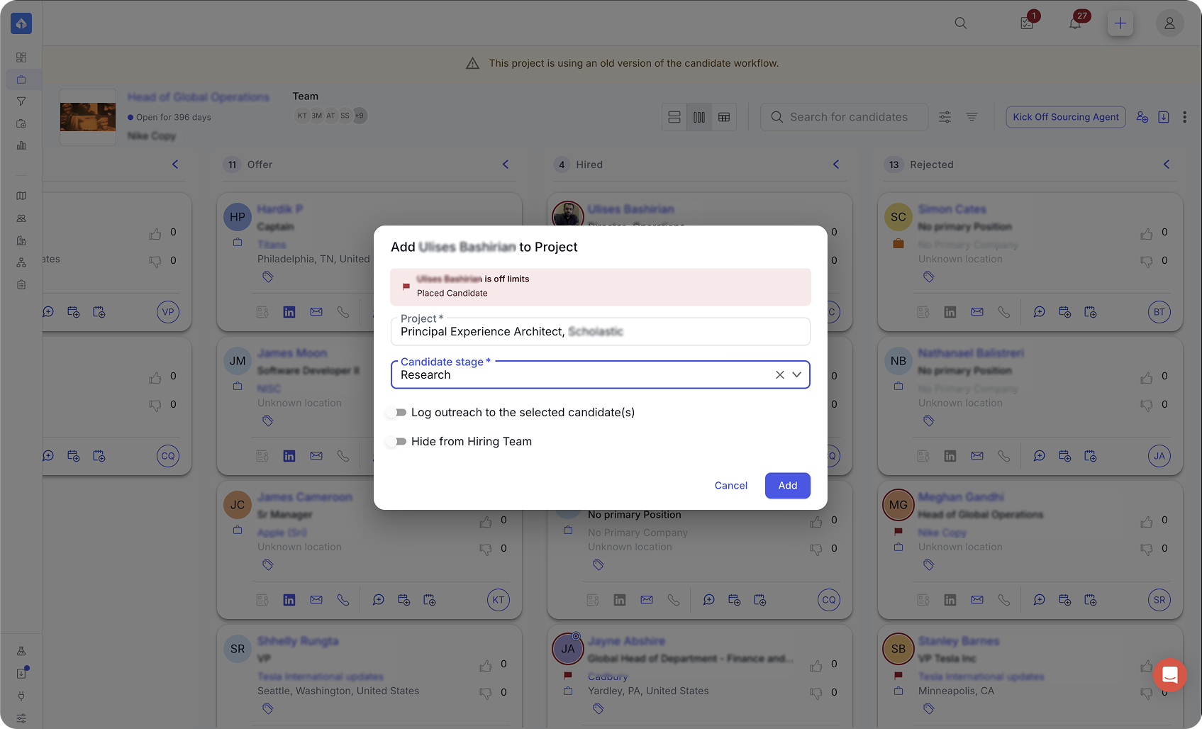
The same thinking shows up at the moment of action. When a recruiter adds a candidate, the app warns them if the person is off-limits, and offers a toggle to hide the candidate from the hiring team in the same step. Drag and drop follows one rule as well: when a column is sorted, position is computed, so manual placement is turned off instead of offering a choice the system cannot honor.
Client portalThe hiring manager's view
The hiring manager sees the same search through a different lens.
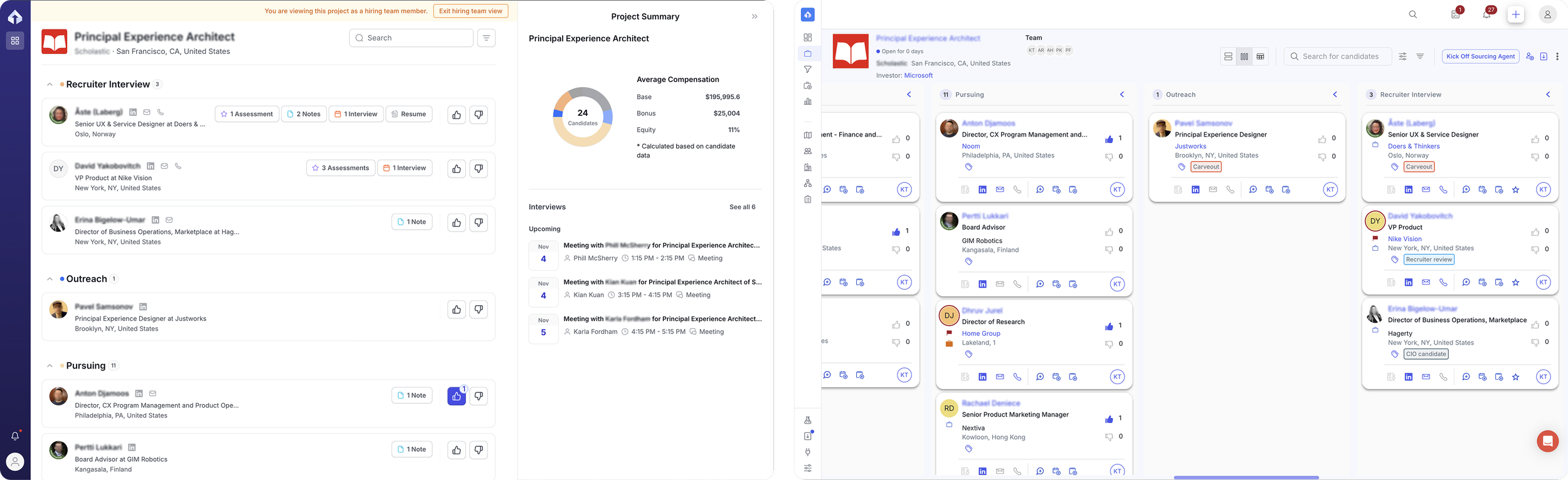
| Search teams | Hiring team | |
|---|---|---|
| Layout | Kanban, list, or table | One list grouped by stage, collapsible with total counts |
| Actions per candidate | About a dozen | Prioritization, add notes, add assessments, review references |
| What they see in a candidate | Multiple tabs covering the candidate's full profile, including experience, past interactions, and their network | Focused on the role search: experience, interviews, notes, references, and assessments |
| What they don't see | N/A | Off-limits, outreaches, activity history, documents, network, the recruiter's sourcing tools, and backchannel references |
| Vocabulary | Scorecards and events | Assessments and interviews |
| Summary | Reports and table views | A project summary with candidate count, average compensation data, project updates, and past and upcoming interviews |
A few decisions worth naming:
- Signals, not decisions.Thumbs up and down tell the recruiter how many people want to proceed. The recruiter or team lead still moves candidates between stages, so authority stays where it belongs.
- A shared vocabulary, translated.The same objects carry different names for different audiences, which keeps the client's screen free of internal jargon.
- Preview before sharing.Recruiters can view the project as a hiring team member, with a clear banner and an easy exit, before the client ever sees it.
- Meeting clients where they are.Recruiters can fill out an assessment on someone's behalf, or send an external link so a client does not have to log into another platform.
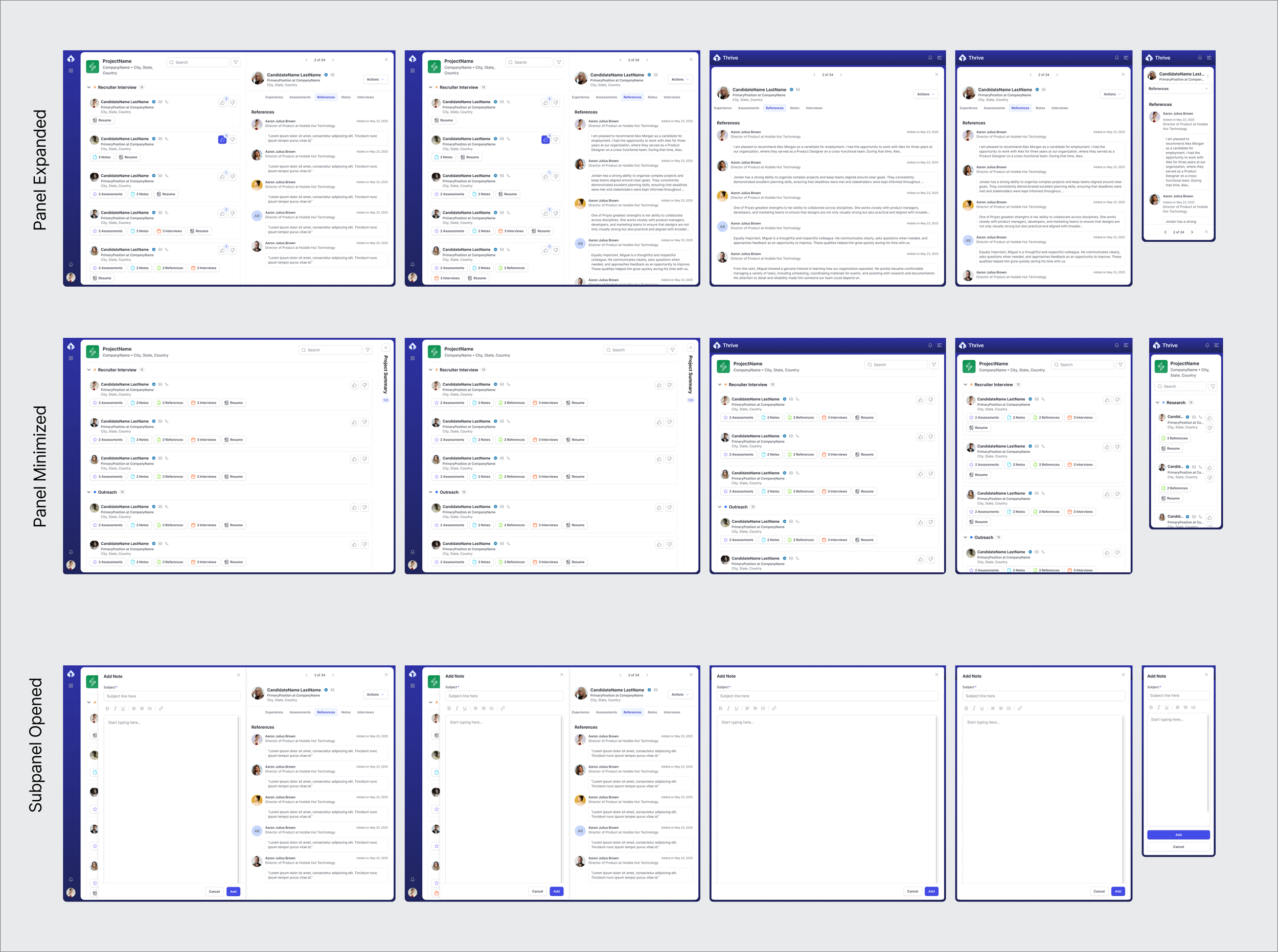
- Responsive design for the on-the-go user.The portal was designed across five breakpoints, with the candidate panel taking over the screen on narrow widths.
PermissionsLayers of control
Who sees what is decided at three levels, each at the moment the recruiter acts.
| Layer | Control | Where it lives |
|---|---|---|
| Candidate | Show or hide this candidate from the hiring team | Eye icon, and a toggle when adding to a project |
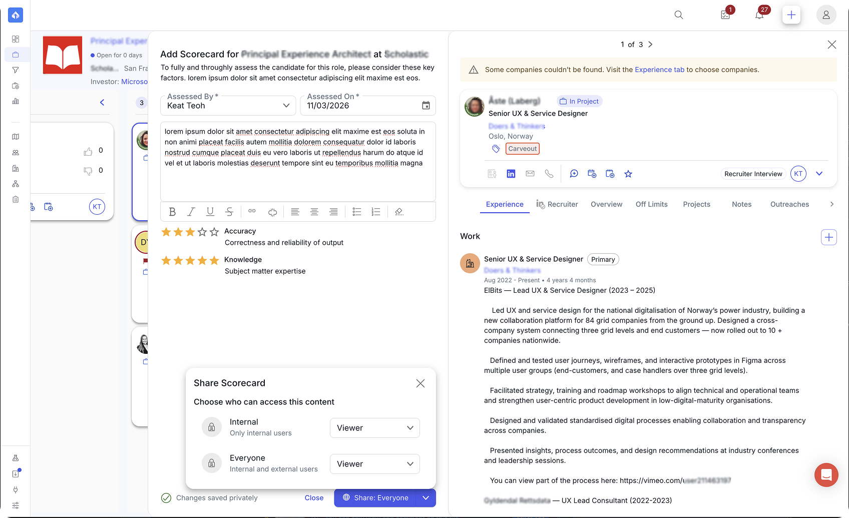
| Data objects | Share a note, assessment, or document, or keep it private | Share control on each form, with drafts saved privately |
| User role and permissions | Whether this hiring manager sees compensation data | The invitation to the client portal, and the admin page |
Compensation shown to the hiring team is always aggregated, never per candidate. Candidates hidden from the hiring team also stay out of generated reports by default.
Sharing is a choice made at the moment of writing, not a setting to find later.
ReportingGetting information to the client
The same data reaches the client in three shapes, matched to three moments.
| Output | Moment | Who drives | Format |
|---|---|---|---|
| Client portal | Anytime between calls | The client | Live and always current |
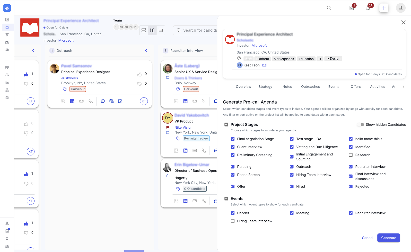
| Pre-call agendas | During or just before a call | The recruiter | Modal to screenshare, copy, or download as a document |
| Project summary reports | Post-call, for analysis or sharing | The recruiter | Exportable spreadsheet |
OutcomesWhat changed
Across the productBeyond one feature
The same approach shows up in work across the product:
- Tagging.An improved candidate tagging workflow across a large legacy taxonomy, with consistent selection and display in cards, expanded cards, and panels. Commonly used tag management moved to an admin page instead of letting anyone add new tags to the shared repository. Recruiters can still create project-specific tags; they stay local and don't affect the admin repository.
- Configurable administration.Admin settings let each organization define its own event types, document types, and team functions.
- Shared patterns.Standardized empty states and form patterns (including autosave forms) across people, companies, and projects, built on a customized MUI-based design system.
- Visibility rules for references.Official references, backchannel information, and client-facing content follow different visibility rules.
ProcessHow I work now
Starting around September 2026, our Director of Product helped the team set up a prototyping workflow that combines VS Code and Claude.
- The setup.The production codebase is cloned into a separate repository and synced at regular intervals. Each prototype branches from that clone, so it starts from real components and real code. There is no backend, so prototypes run on dummy data.
- How I build.I describe the feature in full: the product requirements, the UX requirements, and the scope, so the right pages and panels appear with believable data. Then I iterate in code instead of in static frames. Sometimes the PM arrives with an early prototype and I branch from theirs.
- The process around it.I work in a pod with a PM against a roadmap, mostly migration feature gaps from August to October 2026. For each item we decide what to tackle next, then research it: talking with customer service and with recruiters who are open to speaking with product, and sometimes digging into past usage data.
- Review.I bring a prototype as close to the expected behavior as I can, then review it with the design team weekly, with PMs through a recorded walkthrough, and with developers in daily stand-ups to catch technical constraints. The nearly final version goes to the VP and Director of Product.
- Handoff.With the PM, I write the Jira epic or tickets, attach the Figma artifacts, and walk developers through the prototype live in sprint meetings. Once code is live on a development environment, I join QA as another check for UX friction and bugs.
What AI does and what I keep
AI turns a detailed description into a working prototype quickly. I keep the problem definition, the research, the decisions about what to build and what to leave out, every review, and the final quality check.